
Most Shopify merchants focus on getting more traffic. But the biggest leak in most stores is not traffic. It is what happens between the product page and the cart. A shopper who lands on your product page has already shown interest. Losing them at that moment is not a discovery problem. It is a conversion rate problem.
The global average ecommerce conversion rate sits between 2% and 3%. But that number means nothing on its own. What matters is understanding exactly where in the funnel your store is losing shoppers and which specific fixes move your conversion rate in the right direction.
This guide focuses specifically on the product page to cart journey, where the majority of conversion rate losses occur for most Shopify stores, and what you can do to stop the drop-off today.
Summary
- Section 1: Why the product page to cart step matters most for conversion rate
- Section 2: Fix 1 to Fix 3: Product page fundamentals that directly lift conversion rate
- Section 3: Fix 4 to Fix 5: Trust and urgency signals that push shoppers toward the cart
- Section 4: Fix 6 to Fix 7: Cart experience improvements that protect conversion rate
- Section 5: Tools that help you improve conversion rate on Shopify
Why the Product Page to Cart Step Is Where Conversion Rate Lives
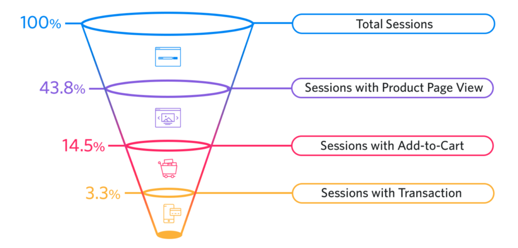
Your conversion rate funnel has multiple stages. But the most critical drop-off point for most Shopify stores is between the product page and the cart. This is where shoppers either decide to move forward or quietly leave.
Understanding why conversion rate drops at this specific point is the starting place for fixing it.
| Stage in the funnel | Common conversion rate issue |
|---|---|
| Homepage to product page | Poor navigation or unclear category structure |
| Product page to add to cart | Weak copy, missing trust signals, unclear offer |
| Cart to checkout | Unexpected costs, complicated checkout flow |
| Checkout to purchase | Payment friction, forced account creation |
The product page to cart stage is where most merchants have the most untapped conversion rate improvement available. Unlike the checkout stage, which Shopify controls significantly, the product page is entirely within your control. Every element on it, from the title to the images to the button copy, either helps or hurts your conversion rate.
The seven fixes in this guide target the most common reasons shoppers leave a product page without adding to cart.
Fix 1: Make Your Value Proposition Instantly Clear
The most common reason a product page fails to convert is that the value is not immediately obvious. A shopper who lands on your product page has three to five seconds to understand what the product is, who it is for, and why it is worth buying. If those three questions are not answered in the first visible section of the page, your conversion rate suffers.
Steps to improve value proposition clarity:
- Rewrite your product title to include the primary benefit alongside the product name. “Waterproof Hiking Boots for Women” outperforms “Trail Boot Model X2” because it answers who the product is for and what it does in the title itself.
- Write the first two sentences of your product description to answer: what is this, who needs it, and what problem does it solve. Save features for further down the page.
- Remove any introductory filler like “Introducing our latest product” or “We are proud to present.” Get to the point immediately.
- Use bullet points for key benefits in the first visible section. Shoppers scan before they read. A scannable benefit list captures more attention than a paragraph.
Time to complete: 20 to 30 minutes per product page.
Impact on conversion rate: High. This is the single most impactful change most product pages can make.
Fix 2: Use High-Quality Images That Answer Purchase Questions
Product images do not just show what a product looks like. They answer the questions shoppers have before they feel comfortable enough to add to cart. A shopper who cannot clearly see the size, texture, detail, or scale of a product has no way to resolve their hesitation through images, and that unresolved hesitation directly lowers your conversion rate.
What your product images need to show:
| Image type | What it answers | Impact on conversion rate |
|---|---|---|
| Main product shot | What the product looks like overall | High |
| Detail or texture shot | Material quality and finish | Medium to high |
| Scale shot with context | How big the product actually is | High for non-standard sizes |
| In-use or lifestyle shot | Who it is for and how it feels to use | High for apparel and lifestyle products |
| Back or underside shot | Complete picture for complex products | Medium |
Use a minimum image size of 2048 x 2048 pixels for product images on Shopify. This ensures zoom functionality works correctly on both desktop and mobile. Compress images before uploading to keep page speed high, which also protects your conversion rate by keeping load times fast.
Fix: Review your top 10 products by traffic. For any product page with fewer than three images, add at least a detail shot and a lifestyle or in-use shot. Measure the conversion rate change over the following four weeks.
Fix 3: Write Product Descriptions That Remove Doubt
A product description that fails to address common purchase objections leaves shoppers with unresolved doubts that lower your conversion rate. Every question a shopper has that goes unanswered on your product page is a potential reason to leave without adding to cart.
The most common doubts that hurt conversion rate at the product page stage:
Will this fit me or my space? Address sizing, dimensions, and compatibility explicitly.
Is this the right material or quality for what I need? Name the specific materials and include care instructions.
Will it arrive in time? State the shipping timeframe directly on the product page, not buried in a separate FAQ.
What if it does not work for me? Mention your return policy near the Add to Cart button, not only in the footer.
Practical approach: Read your customer support emails and reviews for the past three months. The questions that appear most frequently are the exact doubts your product description needs to answer. Add a brief FAQ section below the main description addressing these specific questions. This addition alone can produce a measurable lift in conversion rate within two to four weeks.
Fix 4: Place Trust Signals in the Right Location
Most Shopify stores display trust badges in the footer. That is the wrong place. A shopper who is hesitating on a product page does not scroll to the footer to find reassurance. They either find trust signals near the Add to Cart button or they leave.
Trust signals that improve conversion rate at the product page stage include:
Reviews and star ratings displayed near the product title or price, not only at the bottom of the page.
Payment method icons showing Visa, Mastercard, PayPal, and Apple Pay directly below the Add to Cart button.
A brief, visible return policy statement such as “Free returns within 30 days” placed adjacent to the purchase button.
A security badge such as “Secure checkout” near the payment information.
Third-party endorsements, certifications, or media mentions where relevant to the product.
Before / After for trust signal placement:
| Before | After |
|---|---|
| Trust badges in footer only | Payment icons below Add to Cart button |
| Reviews at the bottom of the page | Star rating visible near product title |
| Return policy in a separate policy page | “30-day returns” note next to Add to Cart |
| No security indication on product page | Secure checkout badge near purchase section |
Each of these placement changes is a conversion rate improvement that requires no new content, only repositioning what already exists on your store.
Fix 5: Create Genuine Urgency Without False Claims
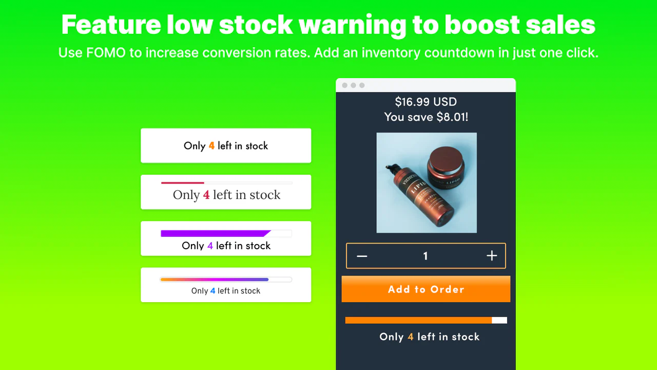
Urgency is one of the most effective conversion rate tools available on a product page, but only when it is genuine. Fake countdown timers that reset on every page reload or permanently displayed “Only 3 left” messages that never change destroy trust when shoppers notice them, which many do.
Genuine urgency that improves conversion rate:
A countdown timer linked to a real promotion end date. If your sale genuinely ends at midnight, showing a live countdown to that deadline creates legitimate urgency.
Stock labels that reflect actual inventory levels. “Only 4 left in stock” is credible when it is true and updates automatically.
Shipping cutoff timers showing how many hours remain to order for a specific delivery date. “Order within 3 hours for delivery by Friday” is one of the highest-converting urgency messages available because it ties directly to a shopper’s practical need.
Implementation: Use a dedicated urgency app that connects timer countdowns and stock labels to your actual inventory and promotion schedule. Urgency that is real is not just more ethical. It is also more effective because it builds the kind of trust that brings shoppers back.
Fix 6: Optimize Your Add to Cart Button
The Add to Cart button is the single most important element on your product page for conversion rate. Everything else on the page exists to create enough confidence for the shopper to click it. The button itself needs to be immediately visible, clearly labeled, and easy to tap on mobile.
Add to Cart button checklist:
The button must be visible without scrolling on both desktop and mobile. If a shopper has to scroll down to find it, you are losing conversion rate.
Use high contrast between the button color and the page background. The button should visually stand out as the most prominent clickable element on the page.
Keep the button label simple and action-oriented. “Add to Cart” or “Buy Now” outperforms clever copy that obscures the action.
On mobile, the button must be large enough to tap accurately with a thumb. A button that is too small frustrates mobile shoppers and directly reduces conversion rate.
Consider a sticky Add to Cart bar that remains visible as the shopper scrolls down the product page. This keeps the purchase action accessible without requiring the shopper to scroll back up.
Improve the Cart Experience to Protect Conversion Rate
Improving the product page increases the add-to-cart rate. But your overall conversion rate also depends on what happens inside the cart. A cart that presents the order clearly, reinforces the value of what is inside, and makes checkout feel easy is essential to completing the conversion rate journey from product page to purchase.
Cart improvements that protect conversion rate:
Show a clear order summary with product images, variant details, and pricing that matches what the shopper saw on the product page.
Display the shipping cost or a free shipping threshold prominently in the cart. “You are $15 away from free shipping” is one of the most effective cart messages for increasing both average order value and conversion rate simultaneously.
Keep the path from cart to checkout as short as possible. Every additional click between cart and completing payment is a point where your conversion rate can drop.
Offer relevant upsells or product recommendations inside the cart that complement what the shopper is already buying. A well-placed upsell increases average order value without reducing conversion rate if it is relevant and non-intrusive.
Tools That Help You Improve Conversion Rate on Shopify
Getting your conversion rate right requires both on-page optimization and the right tools to support the experience. These two apps address the most important dimensions of conversion rate improvement on Shopify.
DECO Product Labels and Badges: Visual Urgency and Trust That Lift Conversion Rate
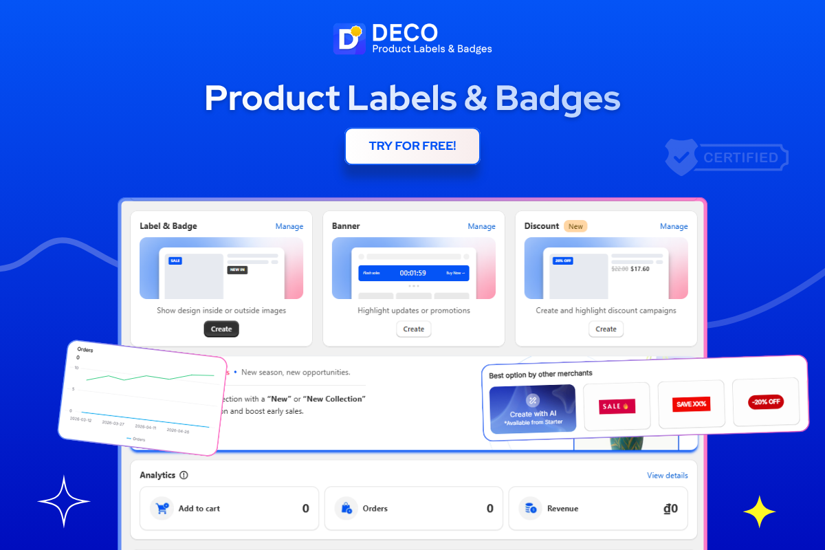
DECO supports your conversion rate by addressing two of the most common reasons shoppers hesitate on a product page before adding to cart: lack of urgency and lack of trust. Both are visual problems that DECO solves directly through labels, badges, and banners placed exactly where shoppers need to see them.
Countdown Timer labels. DECO’s Countdown Timer labels display live countdowns directly on product pages and inside the cart, tied to your actual promotion schedule. When a shopper sees a product page with a live timer showing that a discount expires in four hours, the urgency is immediate and credible. This directly lifts the add-to-cart conversion rate because the shopper has a real, time-sensitive reason to act now rather than wait and come back later.
Stock labels for genuine scarcity. DECO’s stock labels including “Low Stock,” “Only 3 Left,” and “Selling Fast” connect to your actual inventory data to display accurate availability information on product pages. Genuine scarcity messaging consistently improves conversion rate because it removes the perception that the shopper can safely come back later. A shopper who sees that only a few units remain is far more likely to add to cart immediately.
Payment Trust Badges. DECO lets you place payment method icons including Visa, Mastercard, PayPal, and regional options like GCash, Tamara, and Mada directly below your Add to Cart button or inside the Buy Now button itself. This is the highest-impact placement for trust signals on a product page because it answers the shopper’s payment question at the exact moment they are deciding whether to proceed. Seeing a familiar payment icon at that moment removes the last hesitation before the add-to-cart click.
Banner Bars for site-wide conversion rate support. DECO’s Banner Bars display your current promotion or offer across every page of your store, not just the product page where the shopper first sees it. This means a shopper who browses multiple products before deciding is reminded of the offer consistently throughout their session, which protects your conversion rate across the full browsing journey.
Mobile-optimized label sizing. DECO allows you to set separate label and badge sizes for mobile and desktop screens. This ensures that urgency labels and trust badges never overlap the Add to Cart button on smaller screens, which is one of the most common technical mistakes that reduces mobile conversion rate even when the underlying strategy is sound.
Best for: Shopify merchants who want to improve their conversion rate at the product page level by making urgency, scarcity, and trust signals visually prominent and correctly placed at the exact moment shoppers decide whether to add to cart.
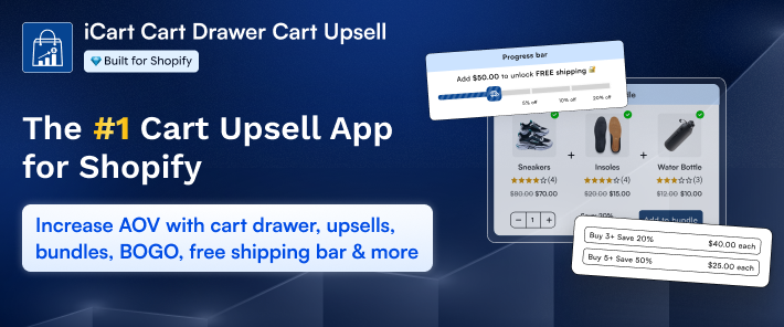
iCart Cart Drawer Cart Upsell: Protect and Improve Conversion Rate Inside the Cart
Once a shopper adds to cart, iCart takes over and ensures that cart experience actively supports your conversion rate rather than undermining it.
iCart transforms your cart into a fully optimized conversion tool. Its cart drawer keeps the purchase flow smooth by allowing shoppers to review and edit their cart without leaving the product page they were on, which reduces drop-off between add-to-cart and checkout.
iCart’s upsell features display relevant product recommendations inside the cart at exactly the moment shoppers are most receptive to adding more, after they have already committed to one purchase. These recommendations are based on what is in the cart, not generic suggestions, which keeps them relevant and non-intrusive.
The free shipping progress bar inside iCart shows shoppers how close they are to a free shipping threshold in real time, which consistently increases average order value and reduces cart abandonment. A shopper who sees “Add $12 more to get free shipping” is motivated to keep shopping, which protects your conversion rate and grows the order value simultaneously.
iCart also supports trust badge placement directly inside the cart drawer, reinforcing the security and policy reassurance that helps shoppers feel confident completing their purchase.
Best for: Shopify merchants who want to maximize the conversion rate of every shopper who reaches the cart by creating a cart experience that is clear, persuasive, and upsell-ready without being intrusive.
Start Fixing Your Conversion Rate Today
Every shopper who reaches your product page has already made a partial decision to be interested. Losing them between the product page and the cart is one of the most recoverable problems in ecommerce because everything on that page is within your control.
Start with Fix 1. Rewrite the opening of your top five product pages to lead with clear, specific benefits. Then work through the remaining fixes in order, measuring your conversion rate after each change over a four-week period before moving to the next.
Pair your on-page improvements with SearchPie for SEO and page speed, and iCart for a cart experience that turns add-to-cart events into completed purchases.